GPT Image 2.5: What's New, Review & Prompt Guide
See what changed in GPT Image 2.5, compare Flare and Sunburst with GPT Image 2, and copy prompts for infographics, logos, comics, and diagrams.
GPT Image 2.5 is OpenAI’s September 2026 image-generation update, focused on faster iteration, sharper detail, stronger reference-image fidelity, and more precise editing. The consumer product is officially named ChatGPT Images 2.5, while developers get two API models: GPT-Image-2.5 Flare for speed and GPT-Image-2.5 Sunburst for tighter control.
For creators, marketers, designers, and product teams, the important change is not simply prettier first drafts. OpenAI is trying to make the full revision loop more dependable: preserve the person or product, change only the requested element, and carry earlier decisions through multiple edits. This guide explains what changed from GPT Image 2, what early users are reporting, how to prompt the new models, and which prompts we would test first.
Launch-day review note: We reviewed OpenAI’s announcement, prompting documentation, model pages, and early public examples on September 9, 2026. GPT Image 2.5 is now available inside PixVerse, so creators can test it in the live workflow. The research below remains a source-backed launch review rather than a controlled PixVerse benchmark; community observations are self-reported and should be treated as directional.
GPT Image 2.5 Release: The Official News
OpenAI announced ChatGPT Images 2.5 on September 8, 2026. The company says people now create more than 3 billion images each week across ChatGPT Images and the GPT-Image API models, which helps explain why this release emphasizes iteration speed and editing reliability as much as raw generation quality.
The update is rolling out across all ChatGPT tiers, ChatGPT Work, and Codex on desktop, mobile, and web. In ChatGPT, the release also adds several workflow tools:
- Sketch: draw a rough layout or shape and use it as a visual reference.
- Templates: begin with common formats such as posters, merchandise, and product photos.
- Comments on images: point to a specific area and describe a local edit.
- Prompt sharing: let another person reuse an image prompt with their own references and details.
Developers can access two API routes: gpt-image-2.5-flare and gpt-image-2.5-sunburst. OpenAI’s official GPT Image 2.5 prompting guide recommends starting with Flare when latency matters and Sunburst when quality or editing precision is the harder requirement.
GPT Image 2.5 vs GPT Image 2: What Changed?
GPT Image 2 was already useful for structured visuals, readable headlines, product compositions, UI concepts, and reference-led edits. GPT Image 2.5 concentrates on the places where production workflows still lost time: waiting for generations, preserving identity, limiting an edit to one region, and maintaining decisions over several turns.
| Area | GPT Image 2 | GPT Image 2.5 update | Why it matters |
|---|---|---|---|
| Generation speed | Established quality, but slower iteration in many workflows | OpenAI says Flare delivers up to 50% lower latency | More prompt variants and edit passes in the same session |
| API model choice | One gpt-image-2 route |
Flare for speed; Sunburst for precision-focused work | Teams can route drafts and final assets differently |
| Reference fidelity | Supports high-fidelity image inputs | Better preservation of recognizable subjects and distinctive features | More dependable portraits, products, and brand assets |
| Local editing | Can generate and edit images | Better at changing only the requested object, copy, or background | Less rebuilding after a small revision |
| Multi-turn consistency | Details can drift after repeated edits | Earlier changes are more likely to survive later turns | Stronger iterative design and campaign workflows |
| Visual quality | Strong layout and text capabilities | More natural lighting, richer textures, sharper details, and improved style response | More usable photography, concepts, and presentation assets |
| Output control | Standard quality and size controls | Custom resolutions up to a 3,840-pixel edge, plus xhigh and max quality |
4K-format tests and more precise delivery specs |
| Creative interface | Prompt-led generation and editing | Sketch, templates, comments, and prompt sharing in ChatGPT | More accessible direction for non-technical creators |
There is one important wording difference in OpenAI’s own materials. The announcement describes Flare as producing higher-quality images than GPT Image 2 at 50% lower latency, while the technical prompting guide calls Flare quality “comparable” to GPT Image 2. We would treat the speed gain as the clearer promise and validate the quality claim against a real production set before migrating every workflow.
The API also supports common 2K and 4K-format sizes, including 2048x2048, 3840x2160, and 2160x3840. OpenAI labels outputs above 3,686,400 pixels as experimental, so a nominal 4K option should not be confused with a guarantee of perfect small text, product labels, or print-ready detail.
GPT Image 2.5 Flare vs Sunburst
| Model | Start here when | Trade-off | Our practical recommendation |
|---|---|---|---|
| GPT-Image-2.5 Flare | You need fast drafts, social assets, rapid prototyping, visual search, or high-volume generation | Prioritizes latency over the highest available precision | Use it for exploration and routine assets, then keep it if it passes your acceptance checks |
| GPT-Image-2.5 Sunburst | You need premium campaign creative, detailed product imagery, or tightly controlled edits | Longer generation time | Use it when identity, geometry, small details, or multi-edit stability justify the wait |
The official Flare model page and Sunburst model page list the same token rates: $5 per 1 million text-input tokens, $8 per 1 million image-input tokens, and $30 per 1 million image-output tokens. However, the final cost per accepted asset can still differ because total image-token use, retries, resolution, and quality settings affect the bill. OpenAI also notes that its GPT Image 2 calculator does not estimate GPT Image 2.5 token consumption.
What Early Users Are Saying About GPT Image 2.5
Launch-day reactions are positive about speed, but more mixed about the size of the visual-quality jump. That split is useful: it suggests GPT Image 2.5 should be evaluated as a workflow release, not only by choosing the most attractive image from a few demos.
Speed is the clearest early win
In the Hacker News launch discussion, one developer who reported generating about 50,000 images with GPT Image 2 said average latency in their workflow fell from roughly 104 seconds to 35–40 seconds. The same user saw better handling of supplied references in UI concepts and cleaner skin rendering, while still noticing blurry or uneven micro-glyphs. This is a single self-reported workload, not an independent benchmark, but it aligns with OpenAI’s latency emphasis.
A separate Reddit UI-generation comparison described both 2.5 models as a noticeable improvement over GPT Image 2 across complex reference-led prompts. The tester preferred Flare at medium quality as a draft-generation balance, while continuing to explore where Sunburst’s realism and composition justified the extra time.
General users see progress, but not always a dramatic leap
The launch thread in r/ChatGPT includes users who immediately noticed faster generation and somewhat better facial expressions. Others said the difference from Images 2.0 was hard to identify, questioned whether the rollout had reached their account, or reported that a template misunderstood its own clarifying questions and rendered them into the poster.
That uncertainty matters. ChatGPT may route image work through a product-level experience, while the API lets developers select Flare or Sunburst explicitly. If a comparison does not record the route, size, quality, inputs, and full edit sequence, it is difficult to know whether two people are testing the same thing.
Developers are watching cost visibility and edit behavior
In the OpenAI Developer Community announcement thread, early questions focused on token consumption, calculator coverage, model availability, and whether reasoning-driven retries could replace an image unexpectedly. These are operational concerns rather than proof of a model-quality problem, but they are exactly the details teams should monitor before scaling an integration.
Our launch-day take is straightforward: faster iteration appears to be the most credible immediate gain; subject preservation and local editing are the most valuable capabilities to test; and a universal quality leap is not yet proven by launch-day reports. Hands, shadows, tiny text, detailed UI glyphs, real logos, regulated copy, and product geometry still need human review.
GPT Image 2.5 Prompt Guide
The best GPT Image 2.5 prompts read like compact production briefs. They define the deliverable, assign roles to reference images, describe visible details, quote required copy, and separate the requested change from everything that must stay locked.
A reusable structure is:
Deliverable + subject or reference roles + composition + visible details + exact text + requested change + preservation constraints + output use
1. Name the deliverable and its job
Begin with “Create a product hero image,” “Design one dashboard screen,” or “Edit this portrait.” The job gives the model a success criterion. Add the audience and destination—paid social, ecommerce product page, investor deck, classroom handout, or first frame for video—before stacking style words.
2. Describe what should be visible
Specify subject, action, framing, relative scale, material, lighting direction, palette, and texture. If you want a photograph, say so directly and describe the camera-level appearance. Lens terms can guide the look, but they do not guarantee a physically exact simulation.
3. Treat reference images as named inputs
Assign each input one role: “Image 1 is the product identity reference,” “Image 2 supplies the background,” or “Image 3 supplies the color palette only.” Then state how they combine. This reduces the chance that a style image changes the subject or that a product reference is treated as general inspiration. For a serious multi-reference test, give every image an exclusive job and state what it must not influence.
4. Quote exact text and limit it
Put required copy in quotation marks, say where it belongs, and specify how many times it should appear. Add “no extra text” and inspect every letter. For uncommon brand names, spell them out letter by letter. Use higher quality for small labels or dense diagrams, but keep critical legal and regulated copy in a conventional design tool.
5. Separate the change from the locks
For editing, use a simple pattern:
Change only [target]. Preserve [identity, geometry, pose, layout, lighting, labels, and background]. Match [perspective, material, contact shadows, and color temperature].
This is especially relevant to GPT Image 2.5 because precise editing and subject preservation are central to the release. A vague instruction such as “make it premium” gives the model permission to redesign more than you intended. In a demanding edit, list the locked area in concrete terms: crop, scale, pose, silhouette, label bounds, text, chart modules, or every item outside a named region.
6. Make one important edit per turn
Pass the approved result into the next turn, request one focused change, and repeat the critical locks. OpenAI warns that repeated edits can still alter details. Use the immediately approved output as the new base image, then compare each turn with the prior version at 100% zoom. If a region must remain pixel-identical, composite the approved local edit into the original instead of trusting a generative pass to preserve every pixel.
7. Keep API settings outside the creative prompt
Model, size, quality, format, and transparency are request parameters. Start with a fixed test set, hold those settings constant, and compare Flare, Sunburst, and GPT Image 2 on instruction following, identity, product shape, text, unwanted changes, latency, retries, and cost per accepted image.
Four GPT Image 2.5 Example Prompts
The first four examples focus on jobs where GPT Image 2.5 needs to follow a detailed brief: structured educational graphics, precise on-image copy, consistent characters, and clear composition. Each prompt gives the model a defined audience, canvas, information hierarchy, and explicit constraints. The notes below call out the details we would review before treating a generated asset as production-ready.
1. Technical Cutaway Infographic: Inside an Air Purifier
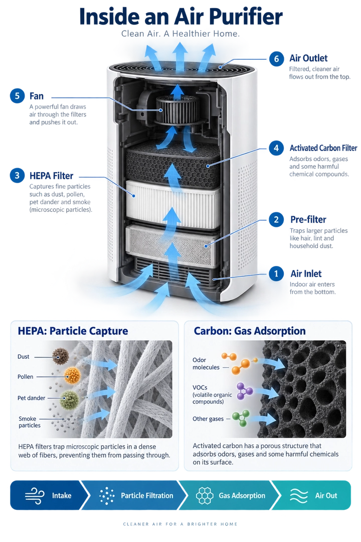
Our take: This is a strong test of technical information design: the model needs to keep component labels, airflow direction, and two different filtration mechanisms legible in one composition. The brief is especially useful because it defines both the required structure and the scientific claims the graphic must avoid. Review before publishing: check every callout, confirm arrows follow a plausible path through the purifier, and verify that the HEPA and carbon detail panels explain distinct processes.
Create a detailed educational infographic explaining how a household air purifier works, designed for an English-speaking consumer audience. Use a vertical 2:3 layout.
Title: “Inside an Air Purifier”
Place a large three-quarter-view cutaway illustration of an unbranded air purifier in the center. Retain part of its white outer casing so viewers can recognize the complete appliance while also seeing the internal filters, fan, and air channels. Use a plausible conceptual design rather than reproducing a specific commercial model.
Number and label these six components:
- Air Inlet
- Pre-filter
- HEPA Filter
- Activated Carbon Filter
- Fan
- Air Outlet
Arrange the labels neatly on both sides of the appliance. Connect each label to the correct component using thin leader lines. Keep labels outside the cutaway so they do not obscure the internal structure.
For this conceptual design, show air entering through the lower section, passing sequentially through the pre-filter, HEPA filter, and activated carbon filter, then moving through an upper fan and exiting through the top. Use continuous blue directional arrows to make the airflow easy to follow. Do not route arrows through solid, sealed components.
Below the main illustration, include two enlarged detail panels. Label the first “HEPA: Particle Capture” and show airborne particles being captured by a fibrous filter. Label the second “Carbon: Gas Adsorption” and show some gas molecules being adsorbed onto porous activated carbon surfaces. Clearly distinguish these mechanisms. Do not suggest that the purifier produces oxygen or removes every pollutant.
At the bottom, add a horizontal process strip with this exact text: “Intake → Particle Filtration → Gas Adsorption → Air Out”
Use the visual style of a professional science magazine: a white background, dark navy headings, restrained blue and teal accents, realistic appliance materials, and crisp diagram annotations. Prioritize readable labels and a clear information hierarchy over dense paragraphs.
All visible text must be in English, using the exact title and labels provided. Do not include Chinese characters, other languages, brand logos, promotional claims, decorative filler, or watermarks.
2. Boutique Tea Brand Logo: Willow & Kettle

Our take: This example tests restraint more than visual complexity. A usable result should preserve the teapot silhouette, botanical negative space, and type hierarchy without turning the emblem into generic tea-house decoration. Review before publishing: inspect the exact spelling and ampersand, confirm the background is truly transparent, and check that the logo stays recognizable at the smallest intended display size.
Design an original logo for a boutique tea brand named “Willow & Kettle”, intended for an English-speaking audience. The identity should feel calm, welcoming, botanical, and refined, combining the comfort of a traditional tea house with a clean contemporary aesthetic.
Create a centered, vertically stacked composition on a square 1:1 canvas.
Main symbol: Feature a rounded teapot in deep forest green, with a gently curved spout pointing left, an open loop handle on the right, and a domed lid topped with a small round knob. Add a thin warm-gold accent beneath the lid. Integrate a subtle leaf-shaped negative-space curve into the teapot body, giving the silhouette a botanical character without making it overly complex.
Place two stylized golden tea leaves beneath the teapot, one extending toward the lower left and the other toward the lower right. Their curved stems should loosely cradle the base of the teapot. Keep the leaves simple and balanced, not arranged as a decorative wreath.
Typography: Below the emblem, render the brand name exactly as: “Willow & Kettle”
Use an elegant, high-contrast serif typeface with distinctive letterforms, a graceful ampersand, and carefully balanced spacing. Keep the wordmark on one line and make it wider than the teapot emblem.
Beneath the wordmark, render: “TEA HOUSE”
Use smaller, widely spaced sans-serif capitals in warm gold. Place a short, thin gold horizontal line on each side of this subtitle. Each text element must appear only once.
Color and finish: Use only deep forest green and warm golden ochre as solid colors. Create crisp, flat, vector-style artwork with smooth contours and clean negative space. The gold should be a flat color, not a metallic or foil effect.
Leave generous clear space around the complete logo. Use a genuinely transparent background, with no visible checkerboard pattern.
Show one standalone logo only. Do not include packaging, signage mockups, bread, wheat stalks, bakery imagery, gradients, shadows, 3D effects, distressed textures, additional slogans, or watermarks.
The only visible text must be “Willow & Kettle” and “TEA HOUSE”. Do not include Chinese characters or any other text.
3. Pixel-Art Character and Animation Sheet
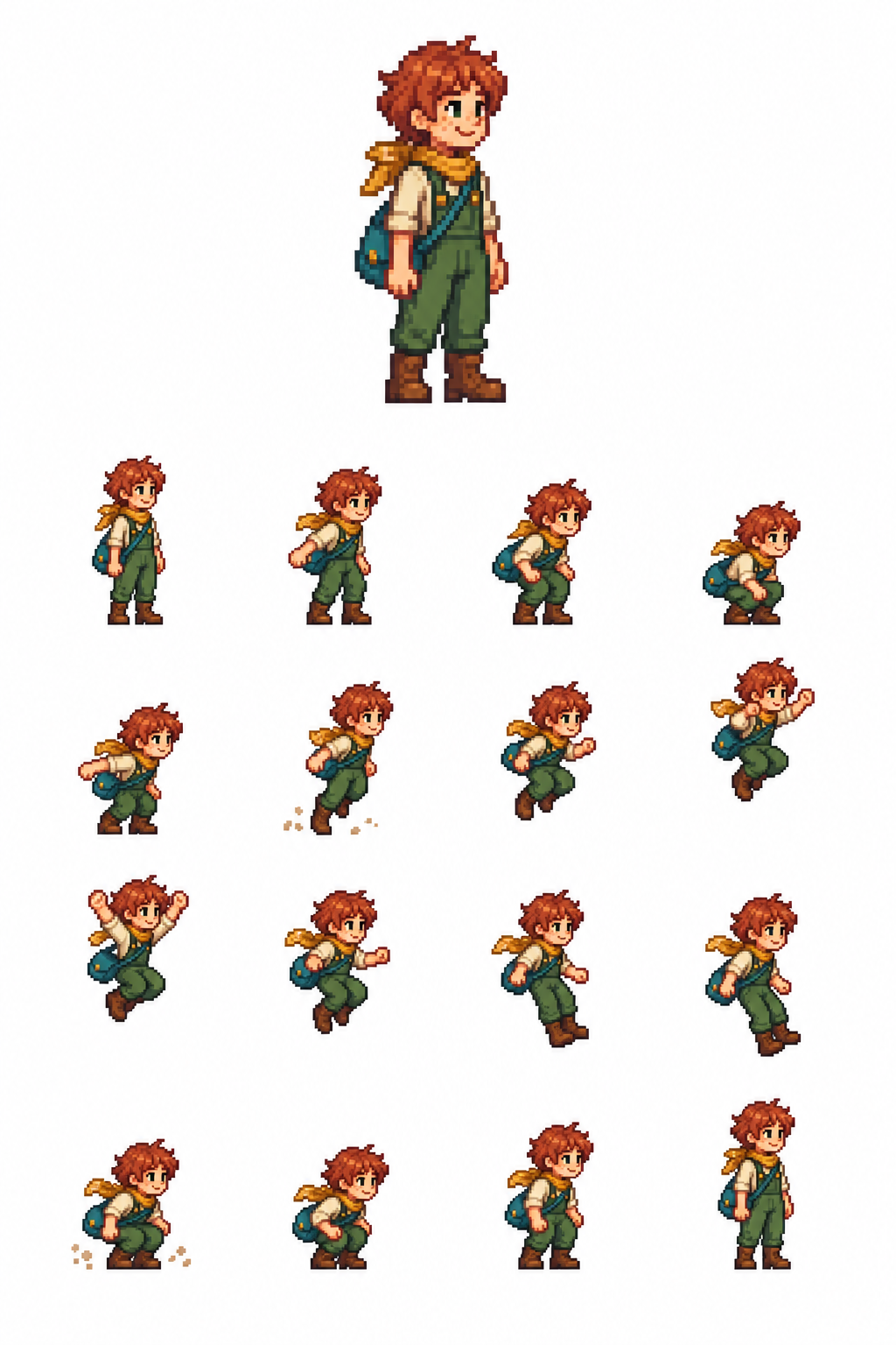
Our take: The value of this prompt is not just an appealing character; it tests whether the model can maintain costume, scale, and a readable motion arc over 16 connected frames. Review before publishing: check the 4×4 sequence in order, confirm airborne poses were not vertically recentered, and compare the first and final idle frames for character consistency.
Create a single white-background pixel-art character and animation sheet.
TOP SECTION — upper 30%: One large, full-body static sprite of an original Stardew Valley–inspired farm adventurer, facing right. Short copper hair, freckles, cream shirt, green overalls, mustard scarf, brown boots and teal satchel. Cheerful expression, relaxed standing pose. Warm, charming 16-bit farming-RPG pixel art.
BOTTOM SECTION — lower 70%: Exactly 16 smaller animation sprites arranged in a strict 4×4 grid, read left to right, top to bottom: Idle → arm swing → shallow crouch → deep crouch → push-off → takeoff → rising → higher rise → jump apex → descending → lower descent → feet reaching down → landing → compressed landing → settle → idle.
All 16 sprites must depict the exact same character, costume, proportions and pixel scale. Keep the horizontal body pivot fixed within every cell. Use a consistent ground baseline, with a smooth vertical jump arc above it. Do not recenter airborne poses vertically. Frame 16 closely matches frame 1.
Keep every complete sprite, satchel and dust particle inside the central 68% of its cell, with generous pure-white gutters. Tiny dust particles only at takeoff and landing. Separate the top portrait from the animation grid with a wide white gap.
Pure opaque white background. Hard pixel edges, limited palette, no blur. No grid lines, labels, numbers, text, watermark, scenery, cropped limbs or overlapping cells.
4. Biology Teaching Diagram: Photosynthesis: From Light to Sugar
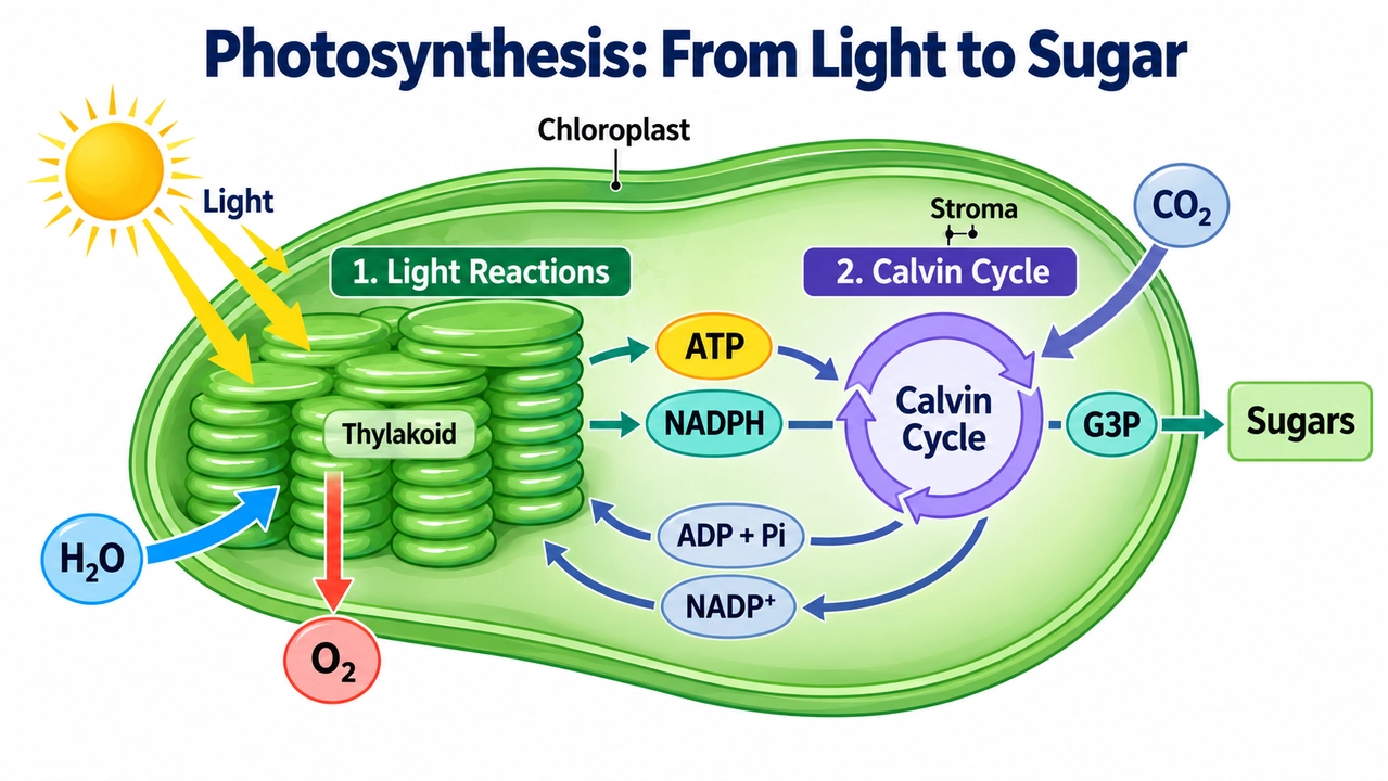
Our take: This is a useful high-stakes diagram test because the image must make a real scientific relationship understandable rather than simply look textbook-like. The prompt correctly distinguishes the light reactions from the Calvin cycle and specifies the return paths that are often omitted. Review before publishing: verify every molecular label, make sure oxygen leaves from the light reactions, and confirm the arrows do not imply that the Calvin cycle directly produces finished glucose.
Create a clear educational biology diagram for English-speaking high school students. Use a horizontal 16:9 layout.
Title: “Photosynthesis: From Light to Sugar”
Build the composition around a simplified cutaway of a chloroplast. Use a clearly defined green outer boundary. Show stacked thylakoids on the left and leave enough space on the right to illustrate the Calvin cycle in the surrounding stroma.
Include these exact structural labels: “Chloroplast” “Thylakoid” “Stroma”
Label the left section: “1. Light Reactions”
Show the light reactions associated with the thylakoid membrane. Use a yellow light arrow labeled “Light” pointing toward the thylakoids. Show “H₂O” entering this stage and “O₂” being released.
Show “ATP” and “NADPH” as distinct, readable molecular labels traveling along arrows from the light reactions to the right-hand section.
Label the right section: “2. Calvin Cycle”
Place the Calvin cycle in the stroma and represent it with a simple circular sequence of arrows. Show “CO₂” entering the cycle, along with ATP and NADPH arriving from the light reactions.
Draw an output arrow from the Calvin cycle to “G3P”, followed by another arrow leading to “Sugars”. Do not imply that the cycle directly produces a finished glucose molecule in a single step.
Use separate, thinner return arrows to carry “ADP + Pi” and “NADP⁺” back toward the light reactions. Keep the outgoing and returning pathways visually distinct, with unambiguous arrowheads and minimal crossings.
Use a white background, consistent flat scientific illustrations, dark navy typography, and a limited palette that clearly separates the two stages. Make the title and stage headings prominent, with large, readable molecule labels and smaller structural labels.
Preserve correct scientific notation, including subscripts and superscripts. Do not show oxygen being produced by the Calvin cycle, and do not suggest that the Calvin cycle occurs only at night.
All visible text must be in English, apart from standard chemical notation. Use only the specified title and labels. Do not include Chinese characters, decorative characters, unrelated equations, dense explanatory paragraphs, mascots, logos, or watermarks.
For more prompt modules covering posters, products, characters, UI, and video-ready frames, use our GPT Image 2 prompt guide. The same prompt structure remains useful for GPT Image 2.5: define the deliverable, specify exact text, and state the elements that must not change.
GPT Image 2.5 Is Now Available on PixVerse
You can now use GPT Image 2.5 on PixVerse to generate structured stills, product concepts, posters, UI mockups, and video-ready first frames from text and reference images. Once a result is approved, animate it in PixVerse or compare the same prompt against other image-model options from one workspace.
For a practical rollout, save your strongest prompts, reference images, sizes, and accepted outputs as a baseline. Then compare accepted-image rate, edit drift, latency, retries, and final cleanup—not only the prettiest first output—as you decide which workflow becomes your default.
For a direct OpenAI-versus-Google baseline, see our GPT Image 2 vs Nano Banana 2 comparison. For motion prompting after the still is approved, use the AI video prompt guide.
GPT Image 2.5 FAQ
What is GPT Image 2.5?
GPT Image 2.5 is the common search name for OpenAI’s September 2026 image update. OpenAI calls the ChatGPT experience ChatGPT Images 2.5 and offers two API models: GPT-Image-2.5 Flare for speed and GPT-Image-2.5 Sunburst for precision-focused generation and editing.
Is GPT Image 2.5 better than GPT Image 2?
OpenAI reports faster generation, improved subject preservation, more precise edits, and stronger multi-turn consistency. Early users most consistently notice speed, while quality reports vary by prompt and route. Treat 2.5 as a promising upgrade, but compare it with GPT Image 2 on your own references and acceptance criteria.
What is the difference between GPT Image 2.5 Flare and Sunburst?
Flare is optimized for fast everyday generation and high-volume iteration. Sunburst takes longer but is intended for demanding work where detail and preservation matter more. Both support generation, editing, transparent backgrounds, flexible custom sizes, and quality settings from low through max.
Can GPT Image 2.5 generate 4K images?
The API documentation lists 3840x2160 landscape and 2160x3840 portrait among common custom sizes. However, OpenAI marks outputs above 3,686,400 total pixels as experimental. Always inspect small text, edges, labels, faces, and product details instead of treating the requested pixel dimensions as a quality guarantee.
How should I write GPT Image 2.5 prompts?
Define the deliverable, subject, composition, visible details, exact text, and final use. Assign each reference image a specific role. For edits, state what should change, list what must stay fixed, and request one major change per turn. Keep model, size, quality, and background in API parameters.
Is GPT Image 2.5 available on PixVerse?
Yes. GPT Image 2.5 is now available on PixVerse. Start with a text prompt or reference image to generate a new visual or make a focused edit, then use PixVerse image-to-video tools when an approved image needs motion.
Final Take
GPT Image 2.5 looks most valuable when an image is not finished after the first prompt. Flare targets faster iteration; Sunburst targets controlled, detail-sensitive work; and both place more emphasis on preserving what already works during edits. The launch-day evidence is strongest for speed and promising—but not yet conclusive—for consistency and quality across every use case.
Start with a real production brief, lock the details that matter, and judge the entire revision sequence. You can try GPT Image 2.5 on PixVerse today, then continue with image-to-video tools when your approved still needs motion.