GPT Image 2.5:新功能、评测与提示词指南
了解 GPT Image 2.5 的更新,对比 Flare、Sunburst 与 GPT Image 2,并获取信息图、Logo、漫画和教学图的可复制提示词。
GPT Image 2.5 是 OpenAI 于 2026 年 9 月推出的图像生成更新,重点提升迭代速度、细节清晰度、参考图一致性和精确编辑能力。其面向消费者的正式名称为 ChatGPT Images 2.5;开发者则可使用两款 API 模型:追求速度的 GPT-Image-2.5 Flare,以及强调精细控制的 GPT-Image-2.5 Sunburst。
对创作者、营销人员、设计师和产品团队而言,重要的变化不只是首稿更好看。OpenAI 试图让完整的修订流程更可靠:保留人物或产品,只改动所要求的元素,并让此前的决定在多轮编辑中延续下去。本指南将说明 GPT Image 2.5 相较 GPT Image 2 的变化、早期用户的反馈、新模型的提示词写法,以及我们会优先测试哪些提示词。
发布日评测说明: 我们于 2026 年 9 月 9 日查阅了 OpenAI 的公告、提示文档、模型页面和早期公开示例。GPT Image 2.5 现已在 PixVerse 上线,创作者可以在实际工作流中测试它。以下研究仍是一篇基于来源的发布日评测,而非受控的 PixVerse 基准测试;社区观察均为用户自述,应仅作趋势参考。
GPT Image 2.5 发布:官方消息
OpenAI 于 2026 年 9 月 8 日发布 ChatGPT Images 2.5。该公司表示,人们如今每周通过 ChatGPT Images 和 GPT-Image API 模型创建逾 30 亿张图像,这也解释了为何此次更新除了原始生成质量之外,同样强调迭代速度与编辑可靠性。
该更新正向所有 ChatGPT 套餐、ChatGPT Work 及桌面端、移动端和网页端的 Codex 推出。在 ChatGPT 中,这次发布还新增了数项工作流工具:
- Sketch: 绘制粗略布局或形状,并将其作为视觉参考。
- Templates: 从海报、商品和产品照片等常见格式开始。
- Comments on images: 指向图像的特定区域并描述局部编辑。
- Prompt sharing: 让他人用自己的参考图和细节复用图像提示词。
开发者可以通过两条 API 路线访问:gpt-image-2.5-flare 和 gpt-image-2.5-sunburst。OpenAI 的官方 GPT Image 2.5 提示词指南建议,在延迟更重要时从 Flare 开始,在质量或编辑精度更难满足时选择 Sunburst。
GPT Image 2.5 与 GPT Image 2 对比:有哪些变化?
GPT Image 2 已适用于结构化视觉内容、可读标题、产品构图、UI 概念和基于参考图的编辑。GPT Image 2.5 则聚焦于生产流程中仍会浪费时间的环节:等待生成、保持主体一致、将编辑限制在一个区域,以及在多轮操作中维持既定决策。
| 方面 | GPT Image 2 | GPT Image 2.5 更新 | 重要性 |
|---|---|---|---|
| 生成速度 | 质量成熟,但许多工作流中的迭代较慢 | OpenAI 表示 Flare 可降低最高 50% 的延迟 | 在同一次会话中完成更多提示词变体和编辑轮次 |
| API 模型选择 | 单一 gpt-image-2 路线 |
Flare 追求速度;Sunburst 面向精度要求更高的工作 | 团队可为草稿和最终资产选择不同路由 |
| 参考图一致性 | 支持高保真图像输入 | 更好地保留可辨识主体和显著特征 | 人像、产品和品牌资产更可靠 |
| 局部编辑 | 可生成和编辑图像 | 更擅长只改动所需对象、文案或背景 | 小改动后需要重建的情况更少 |
| 多轮一致性 | 多次编辑后细节可能漂移 | 早期改动更有可能在后续轮次中保留 | 更适合迭代式设计与营销活动工作流 |
| 视觉质量 | 具备较强的版式和文字能力 | 光照更自然、纹理更丰富、细节更清晰,风格响应更好 | 摄影图、概念图和演示资产更易使用 |
| 输出控制 | 标准质量和尺寸控制 | 支持最长边 3,840 像素的自定义分辨率,以及 xhigh 和 max 质量 |
可测试 4K 格式,并更精确地规定交付规格 |
| 创意界面 | 以提示词驱动生成与编辑 | ChatGPT 中加入 Sketch、模板、评论和提示词分享 | 非技术创作者也更易进行指导 |
OpenAI 自身材料中有一处重要的措辞差异:公告称 Flare 在延迟降低 50% 的同时,生成图像质量高于 GPT Image 2;而技术提示词指南将 Flare 的质量称为与 GPT Image 2“相当”。我们会将速度提升视为更明确的承诺,并在将所有工作流迁移前,用真实生产素材验证质量主张。
API 同样支持常见的 2K 和 4K 格式尺寸,包括 2048x2048、3840x2160 和 2160x3840。OpenAI 将超过 3,686,400 像素的输出标为实验性功能,因此名义上的 4K 选项不应被视为完美小字、产品标签或可直接印刷细节的保证。
GPT Image 2.5 Flare 与 Sunburst
| 模型 | 适合从这里开始的场景 | 取舍 | 我们的实用建议 |
|---|---|---|---|
| GPT-Image-2.5 Flare | 需要快速草稿、社交素材、快速原型、视觉搜索或高量生成 | 将延迟置于最高可用精度之前 | 用于探索和常规资产;若通过验收检查即可继续使用 |
| GPT-Image-2.5 Sunburst | 需要高规格活动创意、精细产品图或严格控制的编辑 | 生成时间更长 | 当主体一致性、几何结构、小细节或多次编辑稳定性值得等待时使用 |
官方的 Flare 模型页面 和 Sunburst 模型页面列出相同的 Token 费率:每 100 万文本输入 Token 5 美元、每 100 万图像输入 Token 8 美元、每 100 万图像输出 Token 30 美元。不过,每个被接受资产的最终成本仍可能不同,因为总图像 Token 用量、重试次数、分辨率和质量设置都会影响账单。OpenAI 还指出,GPT Image 2 计算器并不估算 GPT Image 2.5 的 Token 消耗。
早期用户如何评价 GPT Image 2.5
发布日反应普遍肯定速度,但对于视觉质量提升幅度的评价更为分化。这种分化很有价值:它表明 GPT Image 2.5 应被作为一次工作流更新来评估,而不应只从少数演示中挑选最吸引人的图片来判断。
速度是目前最明确的早期优势
在 Hacker News 的发布讨论中,一位称使用 GPT Image 2 生成过约 50,000 张图像的开发者表示,其工作流中的平均延迟从约 104 秒降至 35–40 秒。该用户还观察到,在 UI 概念中,对提供参考图的处理更好,皮肤渲染也更干净,但仍会遇到模糊或不均匀的微型字形。这是单一用户自述的工作负载,并非独立基准测试,但与 OpenAI 对延迟的强调一致。
另一项 Reddit UI 生成对比认为,在复杂的参考图驱动提示词中,两款 2.5 模型相较 GPT Image 2 都有明显改进。测试者更倾向于将中等质量的 Flare 作为草稿生成的平衡方案,同时继续探索 Sunburst 的真实感和构图在哪些场景值得额外等待。
普通用户看到了进步,但并非总是显著跃升
r/ChatGPT 的发布讨论串中,有用户立刻注意到生成更快、面部表情也有所改善。其他人则表示难以看出与 Images 2.0 的区别,怀疑更新是否已推送到自己的账户,或称某个模板误解了自己的澄清问题,并将它们渲染进了海报。
这种不确定性很重要。ChatGPT 可能通过产品层面的体验来路由图像工作,而 API 允许开发者明确选择 Flare 或 Sunburst。若一次对比未记录模型路由、尺寸、质量、输入内容和完整编辑序列,就很难确定两人是否在测试同样的东西。
开发者关注成本可见性和编辑行为
在 OpenAI 开发者社区的公告讨论串中,早期问题集中在 Token 消耗、计算器覆盖范围、模型可用性,以及由推理触发的重试是否可能意外替换图像。这些是运营层面的担忧,而非模型质量问题的证据,但正是团队在扩大集成规模前应监控的细节。
我们的发布日结论很直接:更快的迭代似乎是最可信的即时收益;主体保留和局部编辑是最值得测试的能力;而发布日反馈尚不足以证明存在普遍性的质量飞跃。 手部、阴影、微小文字、精细 UI 字形、真实 Logo、受监管文案和产品几何结构仍需要人工审核。
GPT Image 2.5 提示词指南
优秀的 GPT Image 2.5 提示词应像精炼的制作简报:明确交付物、为参考图分配角色、描述可见细节、引用必须出现的文案,并将请求的变更与必须锁定的内容分开。
一个可复用的结构是:
交付物 + 主体或参考图角色 + 构图 + 可见细节 + 精确文本 + 请求的改动 + 保留约束 + 输出用途
1. 说明交付物及其用途
以“创建一张产品主视觉”“设计一个仪表盘界面”或“编辑这张肖像”开头。用途让模型拥有成功标准。在堆砌风格词之前,补充受众和投放场景——付费社交广告、电商产品页、投资人演示、课堂讲义或视频的首帧。
2. 描述应该看见什么
指定主体、动作、取景、相对比例、材质、光线方向、色盘和纹理。若想要摄影效果,请直接说明,并描述相机层面的外观。镜头术语可以引导观感,但并不能保证物理上精确的模拟。
3. 将参考图视为具名输入
为每个输入分配一个角色:“图 1 是产品身份参考”“图 2 提供背景”或“图 3 仅提供色彩方案”。随后说明它们如何组合。这样能减少风格图改变主体、或产品参考图被当成通用灵感的可能。对于严肃的多参考图测试,为每张图分配独有任务,并说明它不得影响什么。
4. 引用精确文案并加以限制
将必须出现的文案放进引号,说明其位置和出现次数。加上“不要额外文字”,并检查每一个字母。对于不常见的品牌名,逐个字母拼写。小标签或密集图表可使用更高质量设置,但关键法律或受监管文案仍应在传统设计工具中完成。
5. 将改动与锁定项分开
对于编辑,可使用简单模式:
仅更改[目标]。保留[身份、几何结构、姿势、版式、光线、标签和背景]。匹配[透视、材质、接触阴影和色温]。
这与 GPT Image 2.5 尤其相关,因为精确编辑和主体保留是此次发布的核心。像“让它更高级”这样模糊的指令,会允许模型重新设计超出预期的部分。对于要求严格的编辑,请用具体术语列出锁定区域:裁切、比例、姿势、轮廓、标签边界、文本、图表模块,或指定区域之外的每个元素。
6. 每一轮只做一个重要编辑
将已确认结果传入下一轮,请求一项聚焦改动,并重复关键锁定项。OpenAI 警告,多次编辑仍可能改变细节。将刚确认的输出作为新的基础图像,然后在 100% 缩放下把每一轮与上一版本对比。若某个区域必须像素级一致,请把已确认的局部编辑合成到原图中,而不要指望生成式流程保留每个像素。
7. 将 API 设置放在创意提示词之外
模型、尺寸、质量、格式和透明度都是请求参数。先建立固定测试集,保持这些设置不变,然后从指令遵循、主体一致性、产品形状、文字、不需要的改动、延迟、重试和单张验收图成本等方面对比 Flare、Sunburst 和 GPT Image 2。
四个 GPT Image 2.5 示例提示词
前四个示例聚焦于 GPT Image 2.5 必须遵循详细简报的任务:结构化教育图形、精确的图中文字、一致的角色和清晰的构图。每个提示词均为模型定义了明确的受众、画布、信息层级和约束。以下说明指出了在将生成资产视为可投入生产前,我们会检查的细节。
1. 技术剖面信息图:空气净化器内部
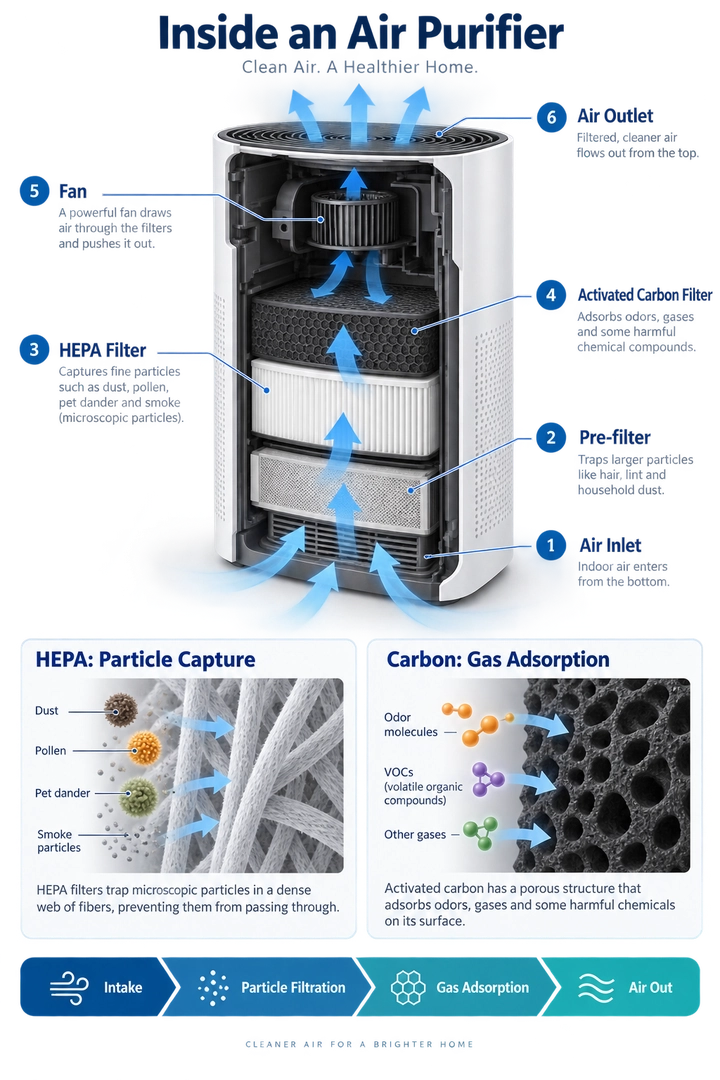
我们的点评: 这是对技术信息设计的一次有力测试:模型需要在一张构图中让组件标签、气流方向和两种不同的过滤机制都清晰可读。这份简报特别实用,因为它同时定义了所需结构和图形必须避免的科学表述。发布前检查: 检查每个标注,确认箭头以合理路径穿过净化器,并验证 HEPA 和活性炭细节面板解释的是不同机制。
Create a detailed educational infographic explaining how a household air purifier works, designed for an English-speaking consumer audience. Use a vertical 2:3 layout.
Title: “Inside an Air Purifier”
Place a large three-quarter-view cutaway illustration of an unbranded air purifier in the center. Retain part of its white outer casing so viewers can recognize the complete appliance while also seeing the internal filters, fan, and air channels. Use a plausible conceptual design rather than reproducing a specific commercial model.
Number and label these six components:
- Air Inlet
- Pre-filter
- HEPA Filter
- Activated Carbon Filter
- Fan
- Air Outlet
Arrange the labels neatly on both sides of the appliance. Connect each label to the correct component using thin leader lines. Keep labels outside the cutaway so they do not obscure the internal structure.
For this conceptual design, show air entering through the lower section, passing sequentially through the pre-filter, HEPA filter, and activated carbon filter, then moving through an upper fan and exiting through the top. Use continuous blue directional arrows to make the airflow easy to follow. Do not route arrows through solid, sealed components.
Below the main illustration, include two enlarged detail panels. Label the first “HEPA: Particle Capture” and show airborne particles being captured by a fibrous filter. Label the second “Carbon: Gas Adsorption” and show some gas molecules being adsorbed onto porous activated carbon surfaces. Clearly distinguish these mechanisms. Do not suggest that the purifier produces oxygen or removes every pollutant.
At the bottom, add a horizontal process strip with this exact text: “Intake → Particle Filtration → Gas Adsorption → Air Out”
Use the visual style of a professional science magazine: a white background, dark navy headings, restrained blue and teal accents, realistic appliance materials, and crisp diagram annotations. Prioritize readable labels and a clear information hierarchy over dense paragraphs.
All visible text must be in English, using the exact title and labels provided. Do not include Chinese characters, other languages, brand logos, promotional claims, decorative filler, or watermarks.
2. 精品茶品牌 Logo:Willow & Kettle

我们的点评: 该示例考验的是克制,而非视觉复杂度。可用的结果应保留茶壶轮廓、植物意象的负空间和字体层级,不能把徽标做成泛化的茶馆装饰。发布前检查: 检查拼写和连字符号是否准确,确认背景是否真正透明,并检查 Logo 在预定的最小展示尺寸下是否仍具辨识度。
Design an original logo for a boutique tea brand named “Willow & Kettle”, intended for an English-speaking audience. The identity should feel calm, welcoming, botanical, and refined, combining the comfort of a traditional tea house with a clean contemporary aesthetic.
Create a centered, vertically stacked composition on a square 1:1 canvas.
Main symbol: Feature a rounded teapot in deep forest green, with a gently curved spout pointing left, an open loop handle on the right, and a domed lid topped with a small round knob. Add a thin warm-gold accent beneath the lid. Integrate a subtle leaf-shaped negative-space curve into the teapot body, giving the silhouette a botanical character without making it overly complex.
Place two stylized golden tea leaves beneath the teapot, one extending toward the lower left and the other toward the lower right. Their curved stems should loosely cradle the base of the teapot. Keep the leaves simple and balanced, not arranged as a decorative wreath.
Typography: Below the emblem, render the brand name exactly as: “Willow & Kettle”
Use an elegant, high-contrast serif typeface with distinctive letterforms, a graceful ampersand, and carefully balanced spacing. Keep the wordmark on one line and make it wider than the teapot emblem.
Beneath the wordmark, render: “TEA HOUSE”
Use smaller, widely spaced sans-serif capitals in warm gold. Place a short, thin gold horizontal line on each side of this subtitle. Each text element must appear only once.
Color and finish: Use only deep forest green and warm golden ochre as solid colors. Create crisp, flat, vector-style artwork with smooth contours and clean negative space. The gold should be a flat color, not a metallic or foil effect.
Leave generous clear space around the complete logo. Use a genuinely transparent background, with no visible checkerboard pattern.
Show one standalone logo only. Do not include packaging, signage mockups, bread, wheat stalks, bakery imagery, gradients, shadows, 3D effects, distressed textures, additional slogans, or watermarks.
The only visible text must be “Willow & Kettle” and “TEA HOUSE”. Do not include Chinese characters or any other text.
3. 像素风角色与动画表
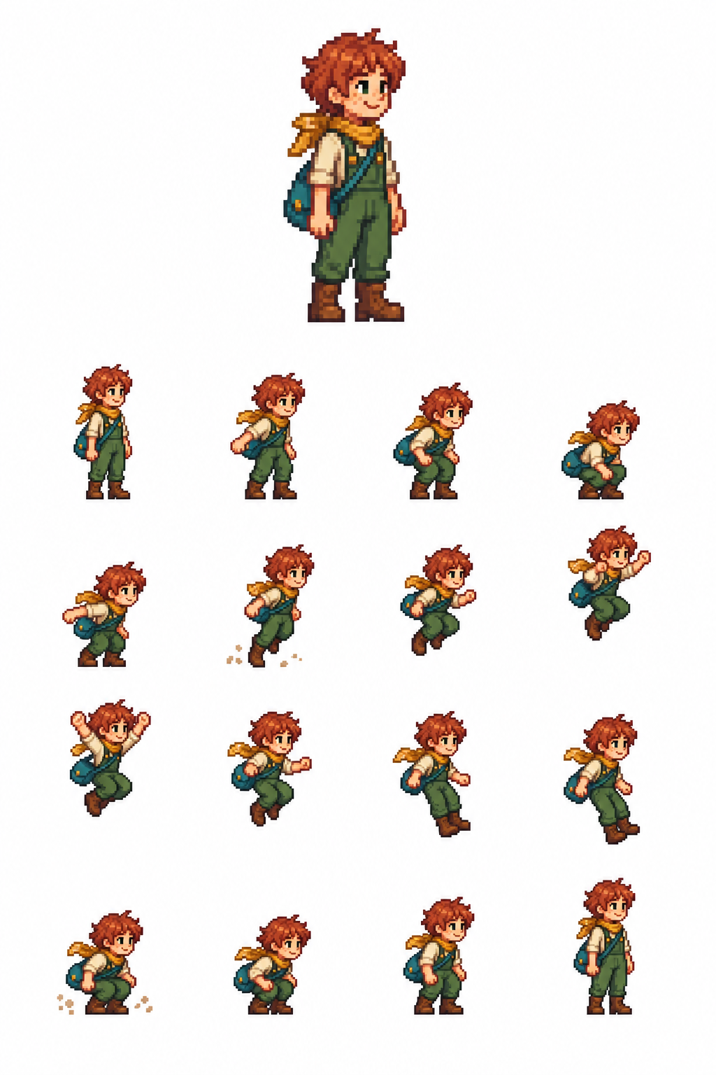
我们的点评: 这一提示词的价值不只在于一个讨喜的角色;它还测试模型是否能在 16 个相连帧中保持服装、比例和清晰的动作弧线。发布前检查: 按顺序检查 4×4 序列,确认空中姿势没有被垂直重新居中,并比较首尾的待机帧是否保持角色一致性。
Create a single white-background pixel-art character and animation sheet.
TOP SECTION — upper 30%: One large, full-body static sprite of an original Stardew Valley–inspired farm adventurer, facing right. Short copper hair, freckles, cream shirt, green overalls, mustard scarf, brown boots and teal satchel. Cheerful expression, relaxed standing pose. Warm, charming 16-bit farming-RPG pixel art.
BOTTOM SECTION — lower 70%: Exactly 16 smaller animation sprites arranged in a strict 4×4 grid, read left to right, top to bottom: Idle → arm swing → shallow crouch → deep crouch → push-off → takeoff → rising → higher rise → jump apex → descending → lower descent → feet reaching down → landing → compressed landing → settle → idle.
All 16 sprites must depict the exact same character, costume, proportions and pixel scale. Keep the horizontal body pivot fixed within every cell. Use a consistent ground baseline, with a smooth vertical jump arc above it. Do not recenter airborne poses vertically. Frame 16 closely matches frame 1.
Keep every complete sprite, satchel and dust particle inside the central 68% of its cell, with generous pure-white gutters. Tiny dust particles only at takeoff and landing. Separate the top portrait from the animation grid with a wide white gap.
Pure opaque white background. Hard pixel edges, limited palette, no blur. No grid lines, labels, numbers, text, watermark, scenery, cropped limbs or overlapping cells.
4. 生物教学图:光合作用:从光到糖
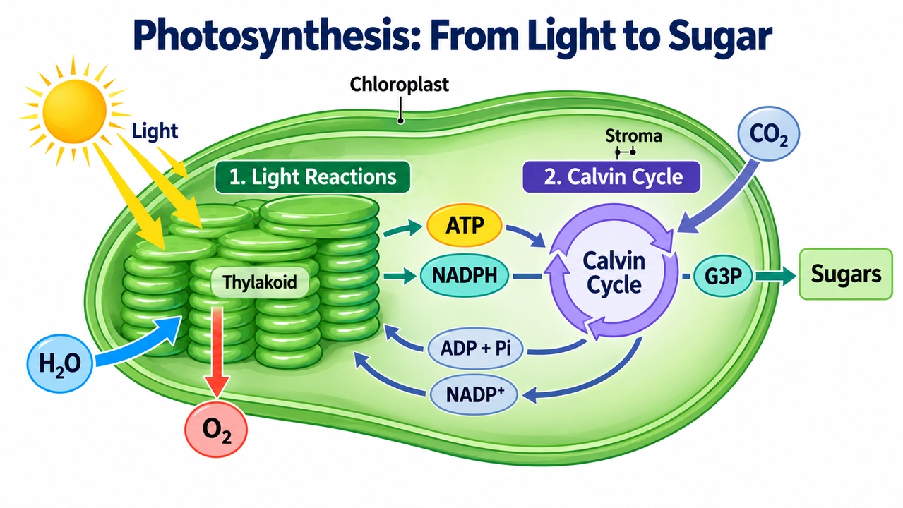
我们的点评: 这是一个很有价值的高要求图解测试,因为图像必须让真实的科学关系变得易懂,而不只是看起来像教科书。提示词正确区分了光反应和卡尔文循环,并明确了常被遗漏的回流路径。发布前检查: 核对每个分子标签,确保氧气从光反应离开,并确认箭头不会暗示卡尔文循环直接产生最终葡萄糖。
Create a clear educational biology diagram for English-speaking high school students. Use a horizontal 16:9 layout.
Title: “Photosynthesis: From Light to Sugar”
Build the composition around a simplified cutaway of a chloroplast. Use a clearly defined green outer boundary. Show stacked thylakoids on the left and leave enough space on the right to illustrate the Calvin cycle in the surrounding stroma.
Include these exact structural labels: “Chloroplast” “Thylakoid” “Stroma”
Label the left section: “1. Light Reactions”
Show the light reactions associated with the thylakoid membrane. Use a yellow light arrow labeled “Light” pointing toward the thylakoids. Show “H₂O” entering this stage and “O₂” being released.
Show “ATP” and “NADPH” as distinct, readable molecular labels traveling along arrows from the light reactions to the right-hand section.
Label the right section: “2. Calvin Cycle”
Place the Calvin cycle in the stroma and represent it with a simple circular sequence of arrows. Show “CO₂” entering the cycle, along with ATP and NADPH arriving from the light reactions.
Draw an output arrow from the Calvin cycle to “G3P”, followed by another arrow leading to “Sugars”. Do not imply that the cycle directly produces a finished glucose molecule in a single step.
Use separate, thinner return arrows to carry “ADP + Pi” and “NADP⁺” back toward the light reactions. Keep the outgoing and returning pathways visually distinct, with unambiguous arrowheads and minimal crossings.
Use a white background, consistent flat scientific illustrations, dark navy typography, and a limited palette that clearly separates the two stages. Make the title and stage headings prominent, with large, readable molecule labels and smaller structural labels.
Preserve correct scientific notation, including subscripts and superscripts. Do not show oxygen being produced by the Calvin cycle, and do not suggest that the Calvin cycle occurs only at night.
All visible text must be in English, apart from standard chemical notation. Use only the specified title and labels. Do not include Chinese characters, decorative characters, unrelated equations, dense explanatory paragraphs, mascots, logos, or watermarks.
如需查看更多适用于海报、产品、角色、UI 和视频首帧的提示词模块,请查看我们的 GPT Image 2 提示词指南。同样的提示词结构依然适用于 GPT Image 2.5:定义交付物、指定精确文字,并说明不得改变的元素。
GPT Image 2.5 现已在 PixVerse 上线
现在,你可以在 PixVerse 上使用 GPT Image 2.5,根据文本和参考图生成结构化静帧、产品概念图、海报、UI 模型图和适合视频制作的首帧。确认结果后,可在 PixVerse 中为其制作动态效果,或在同一工作区用相同提示词比较其他图像模型选项。
在实际落地时,请把最强的提示词、参考图、尺寸和验收输出保存为基准。随后比较验收图比例、编辑漂移、延迟、重试和最终清理工作,而不仅是最漂亮的首张输出,再决定哪种工作流成为默认方案。